Theme Colors
Theme color variables were added in version 2.0. Refer to the change log for full release details.
The visual exposes the report's active theme palette as --pbi-theme-* CSS custom properties, so your content and stylesheet can use the theme's colors without hard-coding hex values. They are defined on the document :root, so they are available throughout your content, and they refresh automatically when the report theme - or Windows high contrast - changes.
This is plain CSS, so it works in every edition (var() survives the Secure edition's sanitizer) - no scripting required.
Use the variables anywhere you'd write a color:
.kpi {
  color: var(--pbi-theme-color-1);
}
.kpi.down {
  color: var(--pbi-theme-bad);
}
.card {
  background: var(--pbi-theme-bg);
  border-color: var(--pbi-theme-fg-neutral-tertiary);
}
Always give a fallback - a theme needn't define every slot, and a variable is emitted only when the theme actually provides that color:
color: var(--pbi-theme-color-9, var(--pbi-theme-fg, #333));
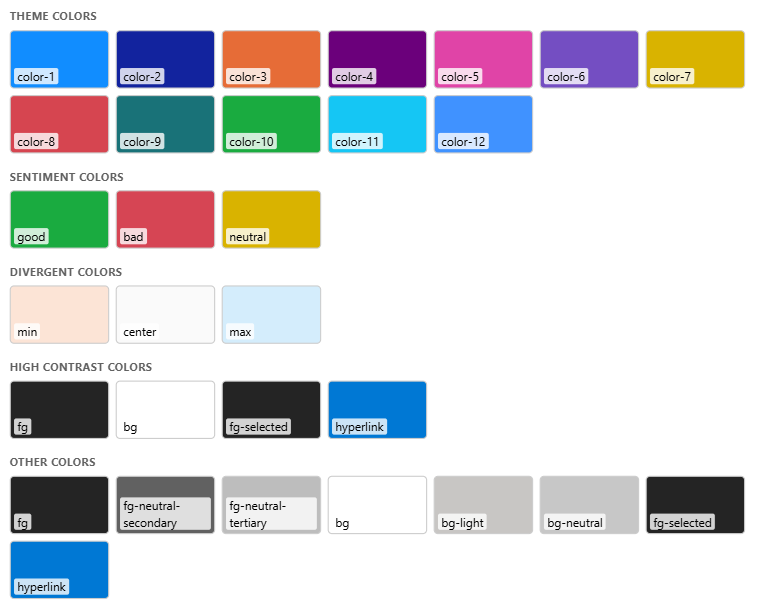
Here's how content styled with these variables looks under the default Power BI theme:
Available Variables
Names mirror the theme JSON keys:
| Group | Variables |
|---|---|
| Data colors | --pbi-theme-color-1 … --pbi-theme-color-N - 1-indexed, matching the theme's "Color 1…N"; N varies by theme |
| Structural | --pbi-theme-fg, --pbi-theme-fg-neutral-secondary, --pbi-theme-fg-neutral-tertiary, --pbi-theme-bg, --pbi-theme-bg-light, --pbi-theme-bg-neutral, --pbi-theme-fg-selected, --pbi-theme-hyperlink |
| Sentiment | --pbi-theme-good, --pbi-theme-bad, --pbi-theme-neutral |
| Divergent | --pbi-theme-min, --pbi-theme-center, --pbi-theme-max |
High Contrast
When Windows high contrast is active, the visual adds the class pbi-theme-hc to #htmlContent (you'll also see it at the top of the Show raw HTML view). Branch on it in pure CSS:
.badge {
  background: var(--pbi-theme-color-3);
}
.pbi-theme-hc .badge {
  background: var(--pbi-theme-bg);
  color: var(--pbi-theme-fg);
}
In high contrast, only four colors are guaranteed meaningful - Microsoft's HC-safe set: --pbi-theme-fg, --pbi-theme-bg, --pbi-theme-fg-selected, and --pbi-theme-hyperlink.
Forced Colors
High contrast also switches the browser into forced-colors mode, which replaces the author's background-color / color with the operating system's palette.
- The theme variables still hold the correct high-contrast values, but the browser won't paint
background: var(--pbi-theme-*)unless you opt the element out withforced-color-adjust: none. - Respect this by default - it is an accessibility feature - and override it only for narrow cases where you must drive the color yourself, then stick to the HC-safe set above.
Good to Know
- No variable → text. CSS can't render a variable's resolved value as text. In the Regular edition, a script can read it - see Reading theme colors in script.
- Iframes. An inline
srcdociframe is a separate document - the variables and thepbi-theme-hcclass do not reach inside it. Style that content directly instead.